tufte course notes
These are my notes from Tufte's course on presenting data and information, which I attended several years ago. As such, some of the information may be outdated. Two key takeaways are that “content is everything” and “the map is the metaphor” - a benchmark for assessing the quality of content.
Overarching Data Display
Don't be tied to existing methods. Do what needs to be done to communicate the information. See Stephen Malinowski's music animation machine.
The National Weather Service webpage is visited daily by a large audience. This site is a good example of clean information presentation on a scrolling page.
Presentations in the future should follow a document/report format.1 4K-8K displays can support the resolution for content presented in this way. Web pages are well suited to handle this type of presentation format. Display resolution (hardware) is rapidly catching up to enable this kind of content delivery. In the past (e.g. 800 x 600 resolution displays) were terribly suited for this, forcing information to be presented in temporal layers (e.g. slides).2
Great information display design is self-effacing. Don't recreate good designs. Find something that works and recreate it. Good starting points for design include the New York Times, Wall Street Journal and Google News. These websites contain around 400 links within the pages with a clean, easy interface.
As a presenter, you need to provide intellectual leadership of your material/content. Communicate the information out of your view/perspective. Quotes from thought leaders go a long way to support/refute your position.
No more "small graphics"! Replace these with tables. Or sentences. Sentences can sometimes be a better communication device for small pieces of information. Reference ESPN's baseball summaries for clear, concise examples. These summaries have been in use for 100 years3.
Show contrasts and comparisons in the data. Make the graphic intuitive. Refer to the graphic in this story for a good example. Annotations are powerful for clear communication and identifying specific, unique characteristics.4
How to Present
Always begin with content. It's all about content.
Follow the Amazon model:
-
every meeting begins with a document, not a deck
-
every meeting begins with a study hall to read the document, 12 min for a 30 min meeting
When taking questions, if you don't know the answer, at least point out where the answer might be found.
"The long and windy road of PowerPoint". Slides are largely not present at the executive level. They are too ineffective/inefficient.5
Templates
LaTeX, HTML, Word, etc.
Develop a few report templates that you will be able to use for many years to come. Come up with a few graphics templates that you can reuse. The same for color palettes.
An abstract is useful. Many people won't read beyond it though.
Annotated Linking Lines
See Beautiful Evidence (78-79), SARS graphic.
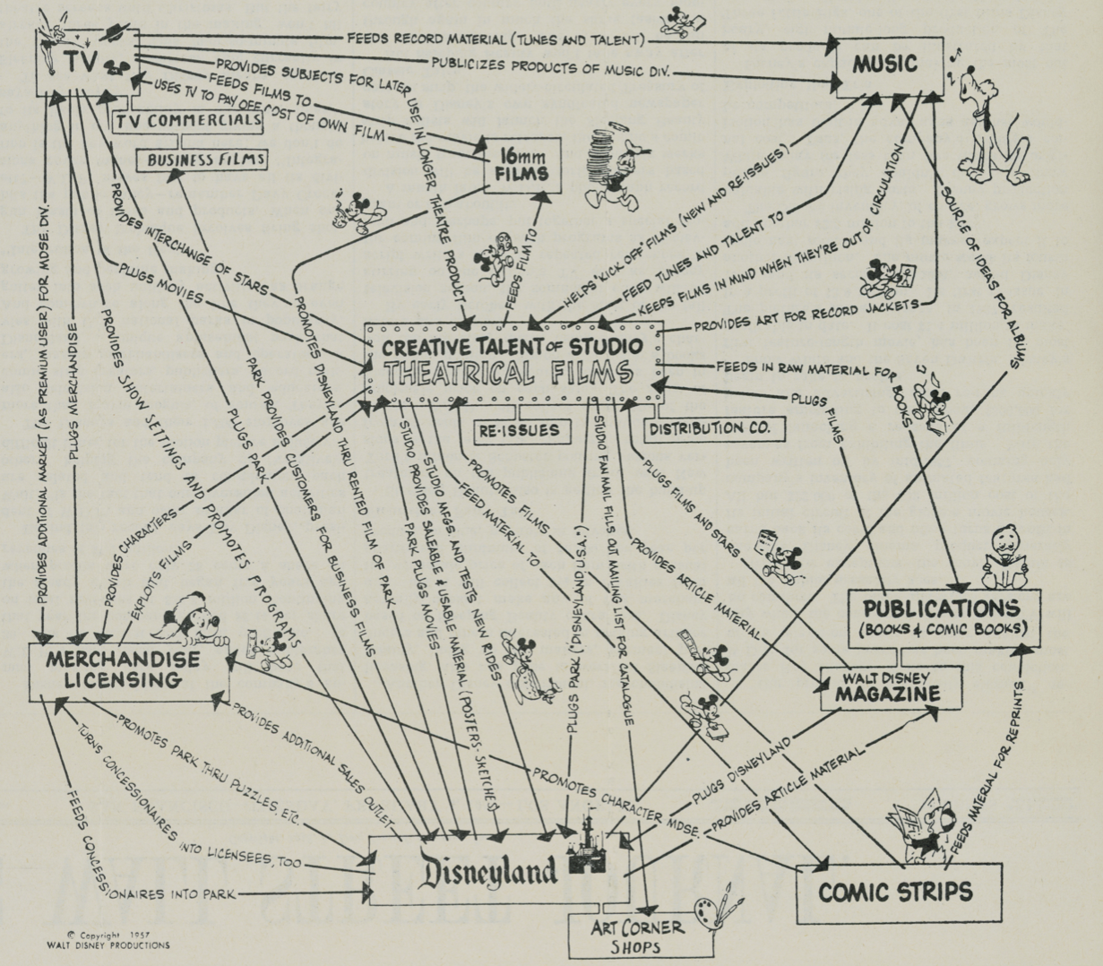
Any kind of intervention thinking requires causality thinking. Use annotated linking lines to support this reasoning.
All statistical inference requires making intelligent comparisons.
See the Disney World org chart ca. 1957 and the Tim Berners-Lee graphic in Information Management: A Proposal.
Analytical Principles
Whatever it takes to explain something. These principles transcend design trends or fashions:
-
show causality
-
show comparisons
-
show contrasts
As an audience member, you should be looking for these principles.
Review the SARS chart in Beatiful Evidence --- the addition of total case loads (or case load time series) to the grey box would improve the graphic.
Design
The design metaphor is the map. Compare your visualizations to Google Maps. Clear displays, subtle colors, layers of information that do not conflict with one another. Don't use saturated colors.
Interface --- the interface should be all about the content. Intuitive interaction; the user/consumer is not spending effort to think about the design, but to think about only the content.
Integrate displays with information, don't segregate them by the mode of production. See Leonardo's hand and Galileo's works. Displays are intertwined with the narrative. Current GUIs do segregate the information.
Do whatever it takes to communicate. Don't pre-specify a method.
The best graphics in Nature are the best graphics period. They are the cutting edge practice.6

Sparklines may attenuate recency biases for streaming/live data. Contour lines are like 3-dimensional sparlines.
Wave fields allow an extension of the eye-brain 'system'. See Tufte's metaphor on the website.
Don't make it original, make it right --- borrow ideas and design themes from existing benchmarks (National Weather Service, Google Maps, etc.)
Messaging
There are two messages in your presentation:
-
Content
-
Credibility
Focus on the content - do you have the right data?
A few things contribute to credibility. Don't lie to your audience. Provide links to data sources. Provide a detailed example of what didn't work; this demonstrates thoroughness and perhaps rigor in what you looked at or considered.
Know your audience vs know your content - content is everything! (in Tufte's view). Most everything can be explained in everyday language; focus on making content better rather than fully knowing your audience.
Learn about how the data were actually collected in the field. Numbers are representations of the real world; instead, look at the real world and see how the number came to be.
People and institutions should not keep their own score.
Spectatorship
Stay on the content.
Keep an open mind, but not an empty head. Look for and consider views contrary to your own.
Give your undivided attention as long as you can; loot the presentation for useful information (diamonds in the swamp).7
Listen, see, think, learn
As a spectator, be wary of cherry-picked data. Are you seeing the fairest/best support for the point of view, or a fair selection of the data? Some things to look for:
-
results that appear to be too good to be true
-
no attribution of source of information, no matter the source
-
incompetence or stupidity
-
bad motives (not likely though)
Look for something different or surprising, not cherry picking or self confirming
Integration of Narrative and Visualization
Euclid and Galileo are preeminant examples of this. Leonardo's hand is another great example. The old written form of communication (paper) allowed authors/creators to do this seemlessly. Powerpoint does not. And Word is still pretty poor at this. HTML may be a better alternative.
Good analytical thinking is good analytical thinking. It persists across time, field of study, problem and communication medium.
2 dimensions ("flatland") --- it is hard to get away from this. Perspective drawings, movies and animations may be a start. Euclid used 3 dimensional geometric shapes, the paper would fold up from the page to create the shape with geometric properties described in the text. Architects use 3 dimensional models.
Different models can act as complements to one another. Consider this when explaining complex problems.
Displays
Paper is the highest resolution "presentation" format currently available. This may not be the case for much longer. 4K, 6K and 8K displays may displace current projection technology.
Consider both spatial resolution (bits per unit area) and temporal resolution (bits per unit time). Try to present content adjacent to other content, e.g. a single flat surface (hence HTML), and endless scrolling page. View graphs/slides are stretched temporally to account for spatial separation.
-
This may be a future opportunity for IPython/Jupyter Notebooks — to embed displays directly in the narrative text. RMarkdown does an excellent job of this already. Other HTML reporting capabilities, and the ability to rapidly develop clean, well organized content (e.g. markdown to HTML via Pandoc) can support this method of presentation. ↩
-
The two formats may seem only slightly different, especially with slide navigation capabilities, and the need to scroll to correct sections in a portrait oriented or scrolling display. But the experience is quite different. ↩
-
Always sort a table by some performance measure, not alphabetically. This allows the reader to learn something from the data being displayed (e.g. top/bottom 10 rankings), simultaneously better communicating the structure of the data. ↩
-
This article probably took 2-3 days to complete. Work to produce documents or reports of this quality on your own work. ESPN game reports are out within 20 minutes of game end. Also, consumer products are outpacing commercial quality displays. See NYT and WSJ for examples. ↩
-
Think about the show Sharktank. Lots of money on the line. Almost every decision is scrutinized. No slides, almost always some kind of demonstration. Only the most salient data is presented, and done so verbally. ↩
-
Animations, time series, step images, paintings... ↩
-
“Be here now. Be somewhere else later.” - Garr Reynolds ↩